Noname (18-2-2004, 22:10:15, Email):
he better .
Garantsu (18-2-2004, 23:11:27):
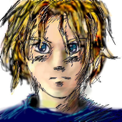
Hmm...Maybe less blurring. Currently it looks as though you got frustrated and decided to blur, then scribble over top. Your shading is very well arranged. On one hand if I look at it for accurate fine lines I'm not impressed, but on the other the way its drawn now that I look more, it seems to have personality. The harder lines contrast well. Impressionistic anime. Should try that with my teacher lol. Good work.
Skeletor (19-2-2004, 15:50:48):
Yes, definitely better! I think this pic would benefit from deciding either; a) just blurry lines and no crisp lines, or b) just crisp lines. Still, I like it.
|
|

